
First of all we need to find a formula for inverse probability distribution, search one in office formula list. Here are some we will plot them.
We need to create a small bin data series (for example with bin of 0.005, from 0 to 1). Then we can simply use scatter plot with smoothed line to visualize the curve.

For example first two formula will plot a beta distribution (regular and cumulative), while the second will plot a normal distribution. Following are the formula.
=BETA.DIST(A2, 4,5, FALSE,0,1)
=BETA.DIST(A2, 4,5, TRUE,0,1)
=NORM.DIST(A2, 0.5, 0.1, FALSE)

Formula for two more distributions, here the x value is from 1 to 20 with bin of 0.1. The following are the formula where the bins are in cell E2.
=CHISQ.DIST(E2,1, FALSE)
=T.DIST(E2, 10, FALSE)

In the similar way we can write own formula and plot the lines. Here we have bins of 0.01 to 2.47 in cell I2 and different formula are used to generate the values and plotted.
=(I2^2+3)
=(I2^2-3)
=(I2^3)
Apply the function to whole data range generate the smothed line xy plot.

Shading under curves:
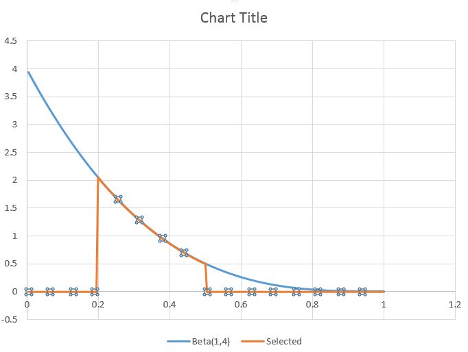
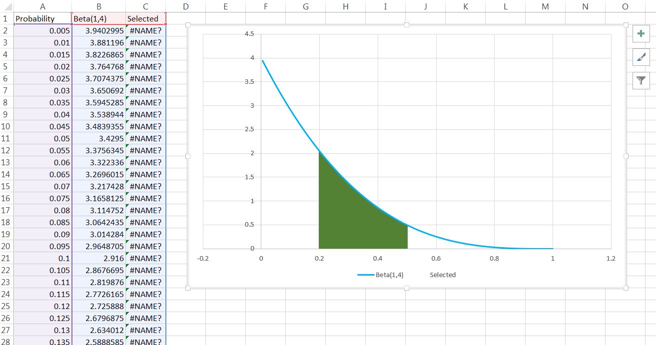
If we want to highlight some portion of these curves we can do so by generating a new data series with values in just areas of intrest and rest is blank. For example if we are interested in Beta (1,4) in x values between 0.2 and 0.5, then first generate a column with full (in B).
=BETA.DIST(A2, 1,4, FALSE,0,1)
Now in C you can filter values B with following formula.
=IF(A2<1,NA,IF(A2 > 3, NA, B2))
Now we generate the curve with all three values. Remove the lines generated for the selected region after adding error bars. Set length of error bars to 100 so that it fills the regions of interest. Remove X error bars. Increase the width of the error bars to fill the space. You can change color of the filled region.
We need to create a small bin data series (for example with bin of 0.005, from 0 to 1). Then we can simply use scatter plot with smoothed line to visualize the curve.
For example first two formula will plot a beta distribution (regular and cumulative), while the second will plot a normal distribution. Following are the formula.
=BETA.DIST(A2, 4,5, FALSE,0,1)
=BETA.DIST(A2, 4,5, TRUE,0,1)
=NORM.DIST(A2, 0.5, 0.1, FALSE)
Formula for two more distributions, here the x value is from 1 to 20 with bin of 0.1. The following are the formula where the bins are in cell E2.
=CHISQ.DIST(E2,1, FALSE)
=T.DIST(E2, 10, FALSE)
In the similar way we can write own formula and plot the lines. Here we have bins of 0.01 to 2.47 in cell I2 and different formula are used to generate the values and plotted.
=(I2^2+3)
=(I2^2-3)
=(I2^3)
Apply the function to whole data range generate the smothed line xy plot.
Shading under curves:
If we want to highlight some portion of these curves we can do so by generating a new data series with values in just areas of intrest and rest is blank. For example if we are interested in Beta (1,4) in x values between 0.2 and 0.5, then first generate a column with full (in B).
=BETA.DIST(A2, 1,4, FALSE,0,1)
Now in C you can filter values B with following formula.
=IF(A2<1,NA,IF(A2 > 3, NA, B2))
Now we generate the curve with all three values. Remove the lines generated for the selected region after adding error bars. Set length of error bars to 100 so that it fills the regions of interest. Remove X error bars. Increase the width of the error bars to fill the space. You can change color of the filled region.
No comments:
Post a Comment