Thursday, April 4, 2013

plotting multiple scatter plots arranged in facets (trallis type) in Excel using RExcel with (with KMggplot2 plugins)

See the related posts on RExcel (for basic, Excel 2003 and Excel 2007) for basic information.

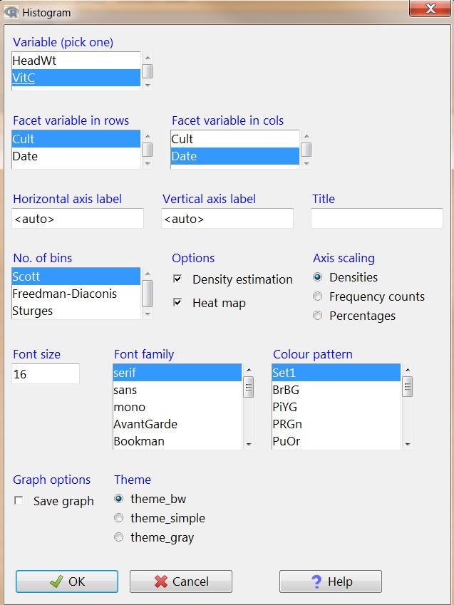
In previous post we created mutiple histograms arrange in row and column (facets, trallis type plots), we can do the same for the scatter plot using RExcel with (with KMggplot2 plugins). Basic step in data loading etc are same. We will use the same cabbage dataset  to deomstrate how we can do this.

 Data is loaded and active, we need to check histograms under KMggplot2 menu. Now we have choice for X variable, Y variable, stratum variable, Facet variable in row or column direction. We can add smoothing curves or opt out by clicking none.


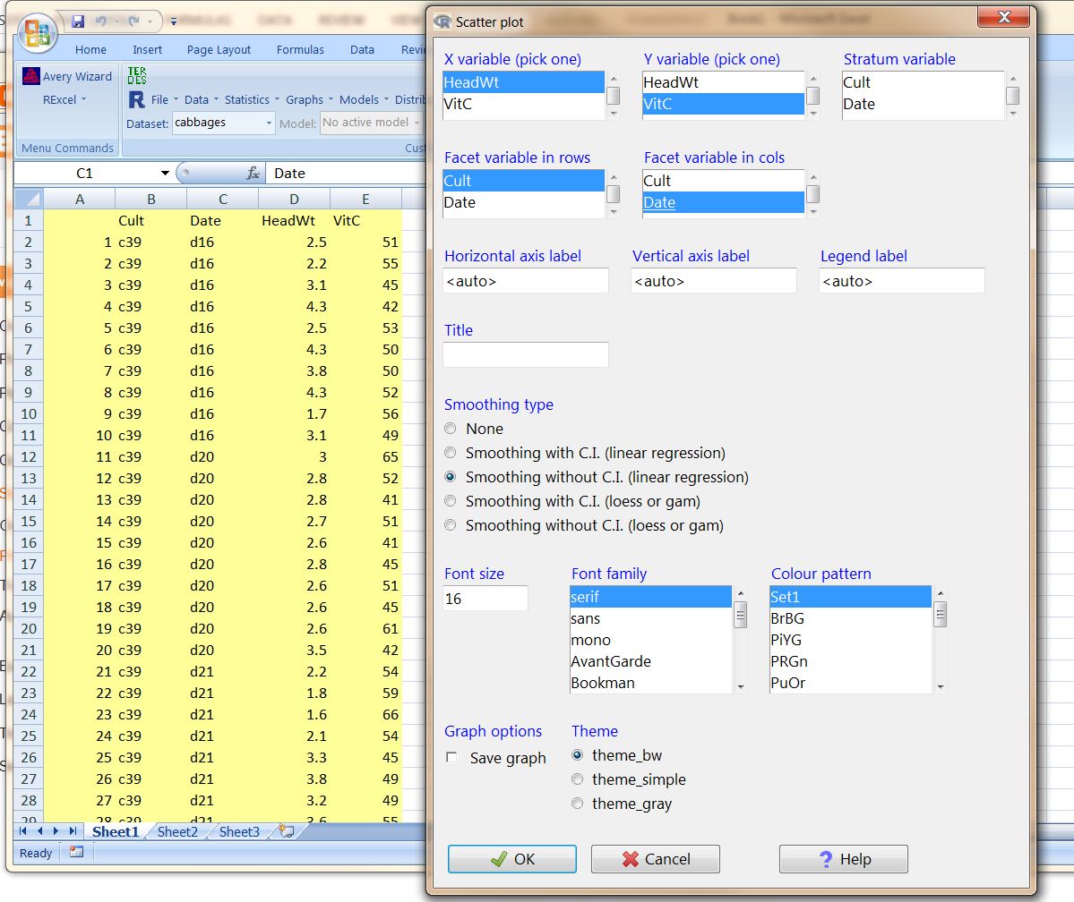
See the nicely arranged publication ready graphs:


plotting multiple histograms arranged in facets (trallis type) in Excel using RExcel with (with KMggplot2 plugins)

See the related posts on RExcel (for basic, Excel 2003 and Excel 2007) for basic information.

We discussed how we can use RExcel in previous posts and we used RExcel we generate voilin box plot and plots. Following the similar steps we can generate mutiple histograms, arranged compact in trallis type fashion.

(1) First load R and then R commander to see R menu in Excel (see previous posts)

(2) Following example uses dataset cabages from the R dataset library. Load the data.

(3) KMggplot2 (unlike other menus is not activated as such), you need to go to tools and then click Load Pug-ins and then select RcmdrPlugin.KMggplot2. It will promt you to restart Rcmcdr click OK. Now you can see a menu with KMggplot2 in your RExcel menus.

(3) Now click  Histogram under KMggplot2 menu. You can see the histogram  box where we have specify different parameters inclusing variable to be plotted, which variable is in rows or columns in facets etc.


See now you have histograms nice looking !

You can density curve over the histograms, also you can also include heatmap within the histogram (cool !) - just click Desnity estimation and or heatmap under options . We are using different variable to pick in the following example.


creating voilin plot / box plot in Excel, using REcel (with KMggplot2 plugins)

See the related posts on RExcel (for basic, Excel 2003 and Excel 2007) for basic information.

We discussed how we can use RExcel in previous posts. By implementing RExcel we generate voilin plots (alternative to box plot in look)

(1) First load R and then R commander to see R menu in Excel (see previous posts)

(2) Following example uses dataset cabages from the R dataset library. Load the data.

(3) KMggplot2 (unlike other menus is not activated as such), you need to go to tools and then click Load Pug-ins and then select RcmdrPlugin.KMggplot2. It will promt you to restart Rcmcdr click OK. Now you can see a menu with KMggplot2 in your RExcel menus.


(4)  Now under KMggplot2 menu click Box plot / Voilin plot / Confidence interval. You can then choose volin or box plot. Pick X and Y variable. X variable can be more than one, if you want to create multi-faceted trallis plot.


So you got your volin plot.


You can produce boxplot instead, just change plot type (perhaps using different grouping structure):


Happy plotting !!

fitting and ploting a regression model in Excel using RExcel

See the related posts on RExcel (for basic, Excel 2003 and Excel 2007) for basic information.

We discussed how we can use RExcel in previous posts. By implementing RExcel we can perform cluster analysis and generate Dendogram plots.

(1) First load R and then R commander to see R menu in Excel (see previous posts)

(2) Following example uses dataset CO2 from the R dataset library. Load the data.

In statstics menu click Fit models and then linear regression.


Now we have to select one respnse variable and explanatory variables (one or more). Click OK will produce a regression model results (see outout window):


Now we can plot the model. Click to models menu and then  graphs select basic dignostic plots. You can see residual vs fitted, Normal Q-Q, Scale-Location, residual vs liverage plots.
Similarly other regression plots are available unders models -> graphs and type of plot.


Similarly other plots available, just play around !


Happy plotting !!

Wednesday, April 3, 2013

Plotting continous distributions (Beta, Gamma, Chi-square, t etc) and discrete distributions (eg. Binomial) in Excel using REXCEL

See the related posts on RExcel (for basic, Excel 2003 and Excel 2007) for basic information.

In previous posts we discussed how to plot different distributions by creating bins and formulas where Y is function of X. But in RExcel it is just easy as click.

Go to continous distributions and then select the distribition you want to plot from the list, and then select submenu plot the distribution. You might need to provide parameter for that distribition, that is it ! click and you will see a curve in plot window.


Similarly other distributions:


In the similarway we can plot discrete distributions are listed under distributions -> discrete distributions. Select distribution you like to plot and select plot the distribution sub-menu.


In the above example we have 200 samples in Binomial distribution.
Look the shape of the distribution, is not it like normal curve. How about when we have 5000 sample.


Strip plot / Strip Chart in Excel using RExcel

See the related posts on RExcel (for basic, Excel 2003 and Excel 2007) for basic information.

We already discussed in previous posts that how to install RExcel to how to load a data.

Let's get a data, here I am loading barley data from R/lattice library. The data is in the long form (unlike many datasets in Excel), data with many treatments or replications or samples are arranged this way.

It is very easy to generate stripe plot using RExcel. From graphics menu select Strip Chart. Then select one or more Factors (or no factors !) and a response variable. If you think there are stacked points, you can keep them as such or jitter so that points in same point will be visible in the plot. Click OK.


Mean Plot (line and error bar plot) in Excel using RExcel

See the related posts on RExcel (for basic, Excel 2003 and Excel 2007) for basic information.

We already discussed in previous posts that how to install RExcel to how to load a data.

Let's get a data, here I am loading barley data from R/lattice library.  The data is in the long form (unlike many datasets in Excel), data with many treatments or replications or samples are arranged this way. Calculating means, standard errors etc is difficults. RExcel can quickly do for you and generate publication ready graphs.

We can select one or two factors and one numeric response variable.


Mean by single factor variety.


Histogram and stem leaf plot in Excel using RExcel

See the related posts on RExcel (for basic, Excel 2003 and Excel 2007) for basic information.

It is very easy to plot histogram using RExcel in Excel. Please follow previous posts regarding RExcel installation, loading and data reading. We will use the ready data - variable to demostrate how to create histogram.

Once the data is loaded, select Graphics then histograms. Select the variable you want to create histogram from.You can change number of bins or used auto. Also you can choose whether you want density or exact count (Frequency) or percentages in Y axis. Click OK.


In the sameway we can create stem-leaf plot. From Graphics menus select stem and leaf plot. Then select a variable and other parameters in dialog box and click OK.


The output is not something fancy graph, rather on the script window like this.


Plot Quantile comparision plot in Excel using RExcel

See the related posts on RExcel (for basic, Excel 2003 and Excel 2007) for basic information.

Sometime we are need to plot a single Qunatile coparision plots. RExcel implemented with Excel can do it easily. Please refer to previous posts about RExcle installation to data loading. Here we are trying to plot a single variable say V2.

(1) Start RExcel and load data. Now under graphics menu select Quantile-Comparision (QQ) plot, Now you have to select the variable you want to plot. You also need to choose type of distribution you want to compare to, default is normal distribution.


Click OK. Now you can see cool QQ comparision plot. If you click identify observation with mouse, then you can identify the observation (may be deviated) with your click (See A9 and A10, I clicked).


Scatter plot matrix in Excel (using RExcel) - plotting histograms or density plot with XY scatter plot

See the related posts on RExcel (for basic, Excel 2003 and Excel 2007) for basic information.

When there are large number of variables we want to see how they are distributed whereas how they are related with each other. Scatter plot matrix is greatway to do it.

(1) We will use the same data we used in previous post, please refere it too see how we can load data and work in RExcel (link is here).

(2) Under graphs menu click scatter plot matrix. Now select the variables you want to plot in scatter plot matrix. You can choose different distribution plots (eg. density, histogram, boxplot, Normal Q-Q plot, one dimensional scatter plot, or even nothing). You have choose whether to plot smoothed line or not. You can accept defaults. Let's say we select 7 variables (V1 to V7).

You can see the plots nicely arranged.

Here are with histogram, boxplot, normal Q-Q plot  in the center.


Plotting Dendogram of Cluster analysis results in Excel using RExcel

See the related posts on RExcel (for basic, Excel 2003 and Excel 2007) for basic information.

We discussed how we can use RExcel in previous posts. By implementing RExcel we can perform cluster analysis and generate Dendogram plots.

(1) First load R and then R commander to see R menu in Excel (see previous posts)


(2)  Now we need to load the data ( a variables in column and observations  in rows - here variables are V1 to V20 while Observations (subjects) are A1 to A30) - please refer to previous blogs on how to load data. Here by selecting data area, right click and put data in R. The provide name of data (here variability) in the box.


(4) Now under stastics menu, you have Dimension analysis -> cluster analysis -> Heirachical Clustering. You can then see the following input box. Now specify different parameters you want to use and plot dendogram to plot the dendogram. You need to select all variables that will be used to classify the observations, and then Click OK.


(5) Now you can see the dendogram plotted in  a R graphics window.


3D Scatter plot in Excel (using RExcel)

See the related posts on RExcel (for basic, Excel 2003 and  Excel 2007) for basic information.

RExcel can produce interactive 3D-scatter plot. For this we need to creat a dataset (please see previous posts to create a dataset in RExcel). Then go to the graphs menu and then select 3D scatter plot. Plots are nice and interactive !!!!

Now select two explanatory variable and two response variable by clicking holding ctrl: If you like to identify the observation holding with mouse check the box labeled with "Identify observations with mouse". If you have more than one group we can do by group too.


In RGL device you can see 3D nice scatter plot.


You can rotate the axis to see the distribution at different angle. You can also identify the points by clicking them.