
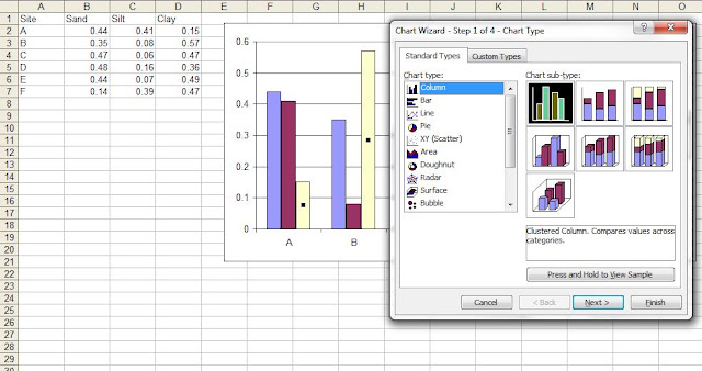
Barplot (column or row bar plots)

How to change negative number to different color or back to black number in axis:


Similarly we can create horizontal and vertical bars:

Adding lines to barplots:
If we like a to add new series and add series lines to all barplots, the following is way to go:

However in many time we just want only or others represented as lines other as bars. Then let's do overlayed bar, select the series only and then change the plot type.


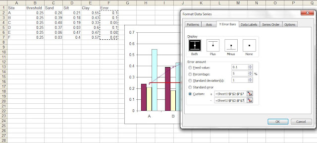
Adding error bars:
Click Format the data series where we want to add the error bar to.


With 2003 it is not possible to add separate labels such as mean comparisons but is possible in excel 2013 it is possible to do so.

Grouped bars:
Over stacked bars, grouped bars provide side by side comparisions of the series.
We can add a number of series and then convert the series to different chart type (for example line type).

Sometime we might want to plot a constant line (such as representing a threshold), we can do so by just specifying a series with just a single value and plot this as line type. Note that the place of series affects the start and end point of the line.

We can add the error bars to the data series we want to add to. We can specify error amount as fixed value or from a column.
A busy plot will look like the following:
 Perhaps overlayed plot will be more suitable for this kind data where sum of the series is 1 (100%) and each component is composition of the whole:

How to change negative number to different color or back to black number in axis:
Similarly we can create horizontal and vertical bars:
Adding lines to barplots:
If we like a to add new series and add series lines to all barplots, the following is way to go:
However in many time we just want only or others represented as lines other as bars. Then let's do overlayed bar, select the series only and then change the plot type.
Adding error bars:
Click Format the data series where we want to add the error bar to.
With 2003 it is not possible to add separate labels such as mean comparisons but is possible in excel 2013 it is possible to do so.
Grouped bars:
Over stacked bars, grouped bars provide side by side comparisions of the series.

We can add a number of series and then convert the series to different chart type (for example line type).

Sometime we might want to plot a constant line (such as representing a threshold), we can do so by just specifying a series with just a single value and plot this as line type. Note that the place of series affects the start and end point of the line.

We can add the error bars to the data series we want to add to. We can specify error amount as fixed value or from a column.

A busy plot will look like the following:

No comments:
Post a Comment