Sometime we are need of overlaying the data points or bars over different types of plots. For this we need coordinates of the data points where we want to plot the data points. There are different image analysis software that can do so. Here is use of WebPlotDigitizer online free tool to do so using a leaf anatomy plot.
Examples:

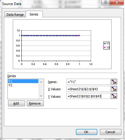
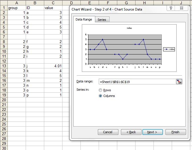
(1) Plot a dummy plot. Here we are setting maximum and minimum co-ordinates to 200 in X and Y.

(2) Insert desired plot in plot area.

(3) Now we need print and scan or take snip of the plot and save file as jpeg.

(3) Find cordinates to points in the plot to be plotted using the image analysis software WebPlotDigitizer :
First load the file in the web application.


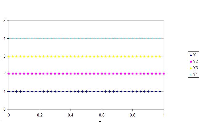
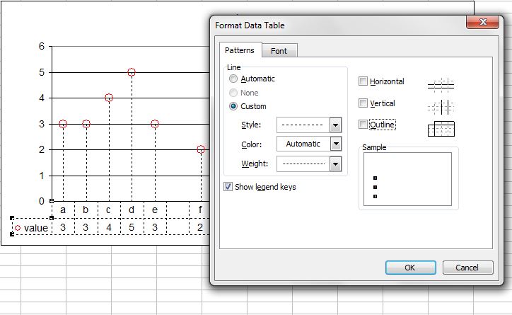
Click the 0, 200 in X-axis and 0,200 in Y axis before proceed.

Now click the point in figure where you want the data to be plotted. Once you are done you can request a csv output. See purple points are selected data points. You can cross check if it is working properly by clicking the known data points (Yellow diamonds in the following figure).

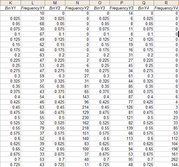
Now copy and paste in file with CVS extension (as suggested in the window) and open then paste in excel sheet.
The co-ordinates of plotting data points can found by simply guessing (for coarse work) in the plot or using some short of tracing act over printed plot. For maps (such as google maps we can find the co-ordinates of the data points)
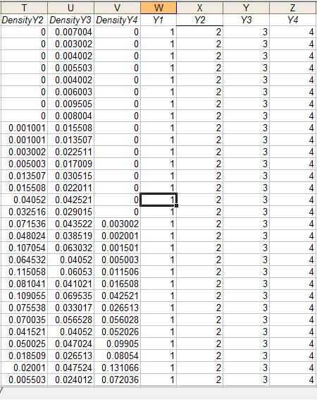
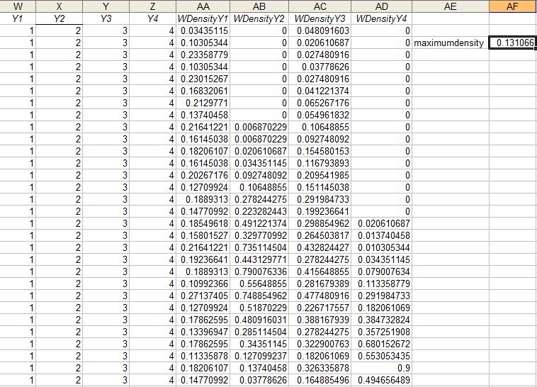
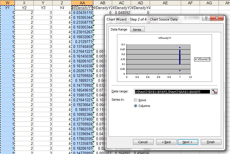
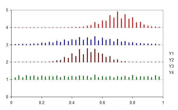
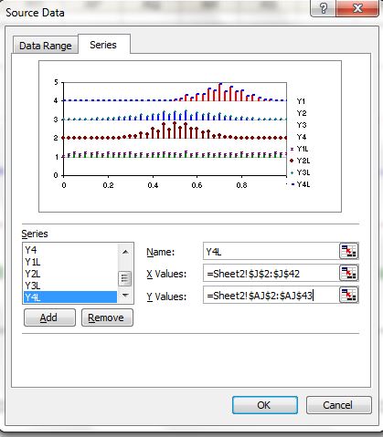
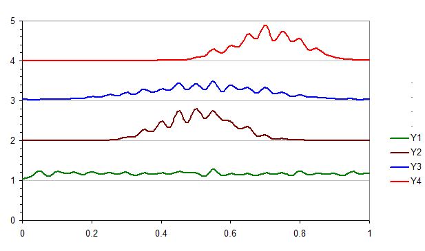
(4) Npw we can simply plot different types of plots - connect lines, connected lines with error bars or bubble plots over the figure. To avoid misalignment if you change any features of the data, the range of the data mush be refreshed. We need to remove the data plotted by previous dummy data set and add new series.


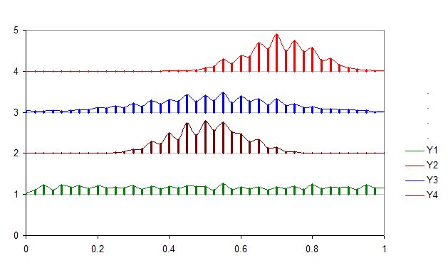
See the trick of plotting 4 extra points in right corner (not in anatomy area) are meant for plotting legend scales. Now the following line connected plot with error bars. Off-course we can just plot the error bars corresponding a value we want to plot.


Creating bubble plot: We can create bubble plot in similar way, which may be more useful where the size of bubble is scaled to certain factor.


A transparent version:


We can similarly overlay over map in the similar way:


Here is example with plotting in chromosomes using same trick:


Examples:


(1) Plot a dummy plot. Here we are setting maximum and minimum co-ordinates to 200 in X and Y.
(2) Insert desired plot in plot area.
(3) Now we need print and scan or take snip of the plot and save file as jpeg.
(3) Find cordinates to points in the plot to be plotted using the image analysis software WebPlotDigitizer :
First load the file in the web application.
Click the 0, 200 in X-axis and 0,200 in Y axis before proceed.
Now click the point in figure where you want the data to be plotted. Once you are done you can request a csv output. See purple points are selected data points. You can cross check if it is working properly by clicking the known data points (Yellow diamonds in the following figure).
Now copy and paste in file with CVS extension (as suggested in the window) and open then paste in excel sheet.
The co-ordinates of plotting data points can found by simply guessing (for coarse work) in the plot or using some short of tracing act over printed plot. For maps (such as google maps we can find the co-ordinates of the data points)
(4) Npw we can simply plot different types of plots - connect lines, connected lines with error bars or bubble plots over the figure. To avoid misalignment if you change any features of the data, the range of the data mush be refreshed. We need to remove the data plotted by previous dummy data set and add new series.
See the trick of plotting 4 extra points in right corner (not in anatomy area) are meant for plotting legend scales. Now the following line connected plot with error bars. Off-course we can just plot the error bars corresponding a value we want to plot.
Creating bubble plot: We can create bubble plot in similar way, which may be more useful where the size of bubble is scaled to certain factor.
A transparent version:
We can similarly overlay over map in the similar way:
Here is example with plotting in chromosomes using same trick:
We can combined with other type of plot used as picture, for example here we used add bars to the dendogram.
Just for fun, we can overlay with other type of plot in background (which is not possible in current excel) - just bars in 3D pie -
Important Note: The scale limit in X and Y axis must be same as used while finding coordinates otherwise the plot points will misaligned.